What's New

2.0.0

2022-05-26T18:20:00Z

General

  • Project is migrated from XCFramework to Swift Package
  • Project now partially supports macOS, tvOS, and watchOS
  • Components are reworked
  • Colors have been reworked
  • Button, state, and value picker components' state enums are removed, and disabled modifier can be used instead
  • Generic type Content is renamed to Label in button and state pickers as per SwiftUI's guidelines
  • ImageBook is made public, and asset icons in library can no be re-set
  • VComponentsLocalizationService is added, that supports localization within the package
  • Several internal properties are now exposed to public in models
  • blinder is renamed to dimmingView

VPrimaryButton

  • Button loader size is changed from 10 to 15

VSquareButton

  • Button font is changed to system bold size 15

VPlainButton

  • Button font is changed to system medium size 15

VChevronButton

  • Button is removed in favor of more general VSquareButton

VCloseButton

  • Button is removed in favor of more general VSquareButton

VWebLink

  • VWebLink is renamed to VLink

VToggle

  • titleLineLimit is added to VToggleModel

VCheckBox

  • titleLineLimit is added to VCHeckBoxModel

VRadioButton

  • titleLineLimit is added to VRadioButtonModel

VSegmentedPicker

  • headerLineLimit and footerLineLimit are added to VSegmentedPickerModel

VMenuPicker

  • Label issue with iOS 15 is fixed

VWheelPicker

  • headerLineLimit and footerLineLimit are added to VWheelPicker

VRangeSlider

  • RangeSlider would now crash if invalid height parameters are used

VBaseTextField

  • TextField is obsoleted by native TextField since SwiftUI 3.0, and is removed

VTextField

  • TextField now support native focusable() API
  • VTextFieldHighlight is removed in favor of custom VTextFieldModel's
  • TextField Height is changed from 50 to 45
  • TextField corner radius is changed from 10 to 12
  • Placeholder font is changed to system size 16
  • warning highlight is added to VTextFieldModel
  • headerLineLimit and footerLineLimit are added to VTextFieldModel

VSheet

  • Sheet margins are changed from 10 to 15

VAccordion

  • VAccordion is renamed to VDisclosureGroup
  • DisclosureGroup margins are changed from 10 to 15

VBaseList

  • VBaseList is renamed to VList
  • List can now be initialized with constant range and row content

VList

  • List is removed in favor of VBaseList (now VList) and VSheet

VSectionList

  • List is removed in favor of VBaseList (now VList) and VSheet

VTabNavigationView

  • TabNavigationView is removed

VNavigationView

  • NavigationView is removed

VModal

  • Modal is migrated to new SwiftUI 3.0 API
  • Modal now supports landscape mode
  • headerAlignment is added to VModalModel
  • Modal margins are changed from 10 to 15
  • Modal now has option for adding shadow

VHalfModal

  • VHalfModal is renamed to `VBottomSheet
  • BottomSheet is migrated to new SwiftUI 3.0 API`
  • BottomSheet now supports landscape mode
  • headerAlignment is added to VBottomSheetModel
  • BottomSheet can now be snapped to height by dragging it at high velocities
  • BottomSheet now supports content autoresizing
  • BottomSheet height has changed to 0.6, 0.6, and 0.9 ratios of screen height as min, ideal, and max heights
  • BottomSheet margins are changed from 10 to 15
  • BottomSheet now has option for adding shadow
  • Issue with modal snapping to max height if dragged to min when pullDown dismiss type is not enabled is fixed
  • BottomSheet would now crash if invalid height parameters are used

VSideBar

  • SideBar is migrated to new SwiftUI 3.0 API`
  • SideBar now supports landscape mode
  • SideBar margins are changed from 10 to 15
  • SideBar now has option for adding shadow

VDialog

  • VDialog is renamed to VAlert
  • Alert is migrated to new SwiftUI 3.0 API`
  • Alert now supports landscape mode
  • Alert can now be created with Error
  • Alert now has option for adding shadow
  • description is renamed to message

VActionSheet

  • VActionSheet is renamed to VConfirmationDialog
  • ConfirmationDialog is migrated to new SwiftUI 3.0 API`
  • description is renamed to message

VMenu

  • Label issue with iOS 15 is fixed

VToast

  • Toast is migrated to new SwiftUI 3.0 API`
  • rounded VToast.Layot.CornerRadiusType is renamed to capsule
  • custom VToast.Layot.CornerRadiusType is renamed to rounded
  • VToastType oneLine is renamed to singleLine

VPageIndicator

  • PageIndicator would now crash if invalid height parameters are used

VBaseView

  • View is removed as it offers no additional customization

VText

  • VTextType oneLine is renamed to singleLine

Other

  • StateColors's and StateOpacities's are replaced withGenericStateModel's
  • LayoutGroup's is renamed to EdgeInsets's
  • VPickableItem is renamed to PickableEnumeration

VComponents

Table of Contents

Description

VComponents is a SwiftUI package that contains 30+ customizable UI components.

Compatibility

VComponents Release iOS
2.0.0 2022 05 26 15.0
1.0.0 2021 02 07 14.0

Components

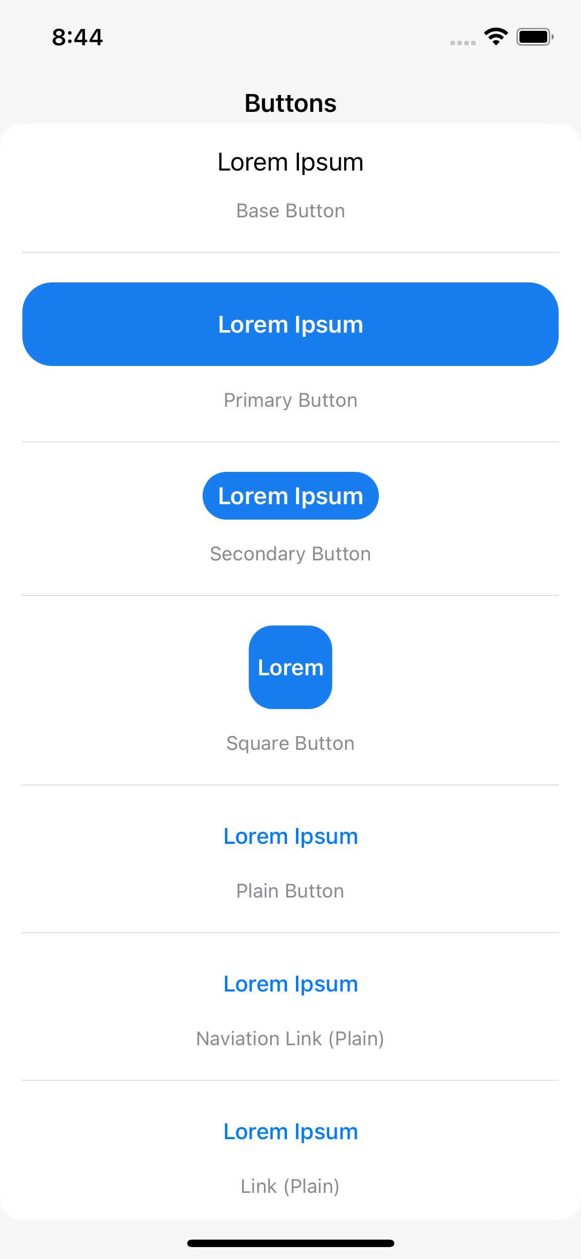
Buttons. VBaseButton, VPrimaryButton, VSecondaryButton, VSquareButton, VPlainButton, VNavigationLink, VLink

State Pickers. VToggle, VCheckBox, VRadioButton

Item Pickers. VSegmentedPicker, VMenuPicker, VWheelPicker

Value Pickers. VStepper, VSlider, VRangeSlider
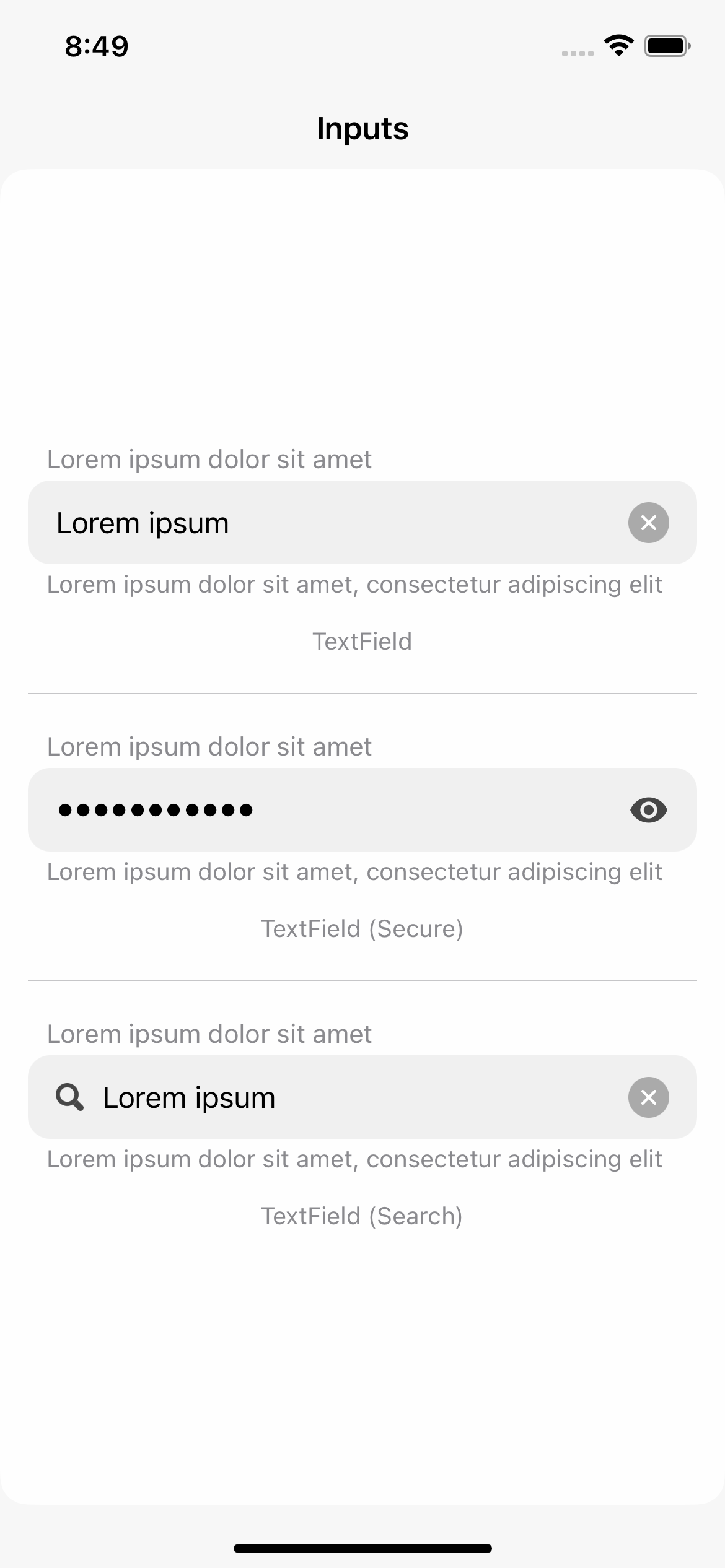
Inputs. VTextField

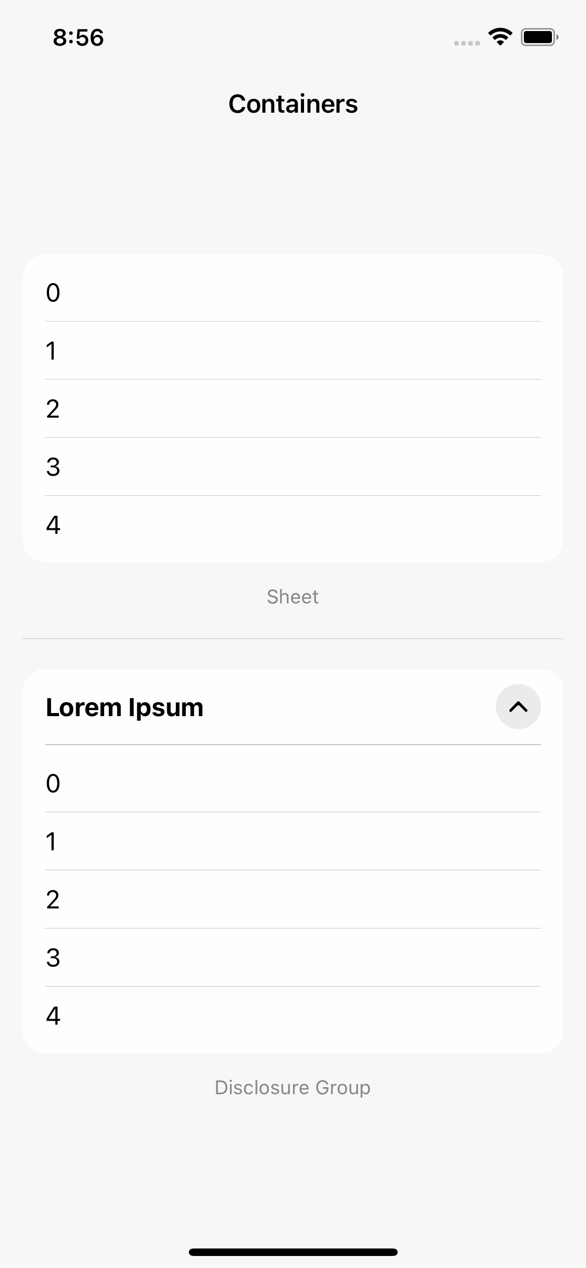
Containers. VSheet, VDisclosureGroup

Lists. VLazyScrollView, VList

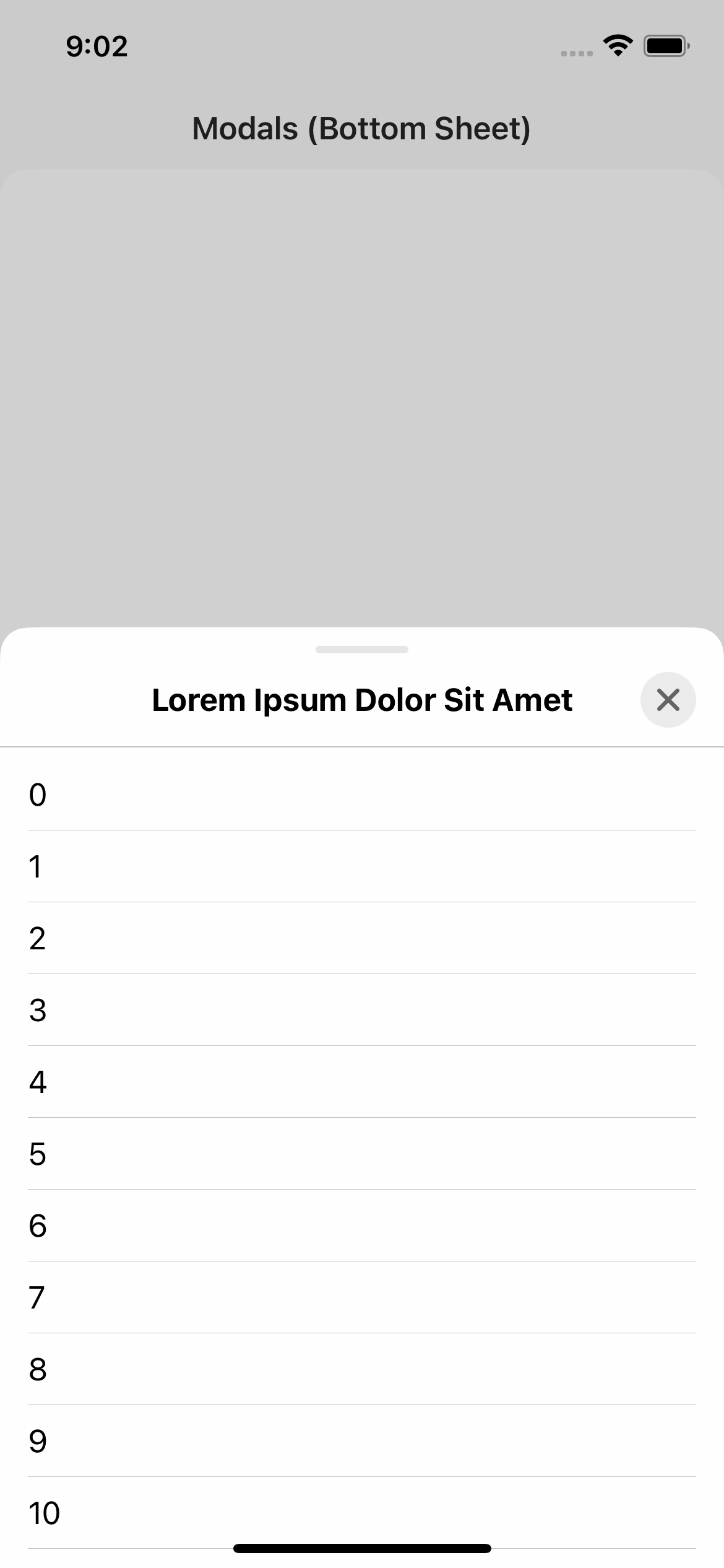
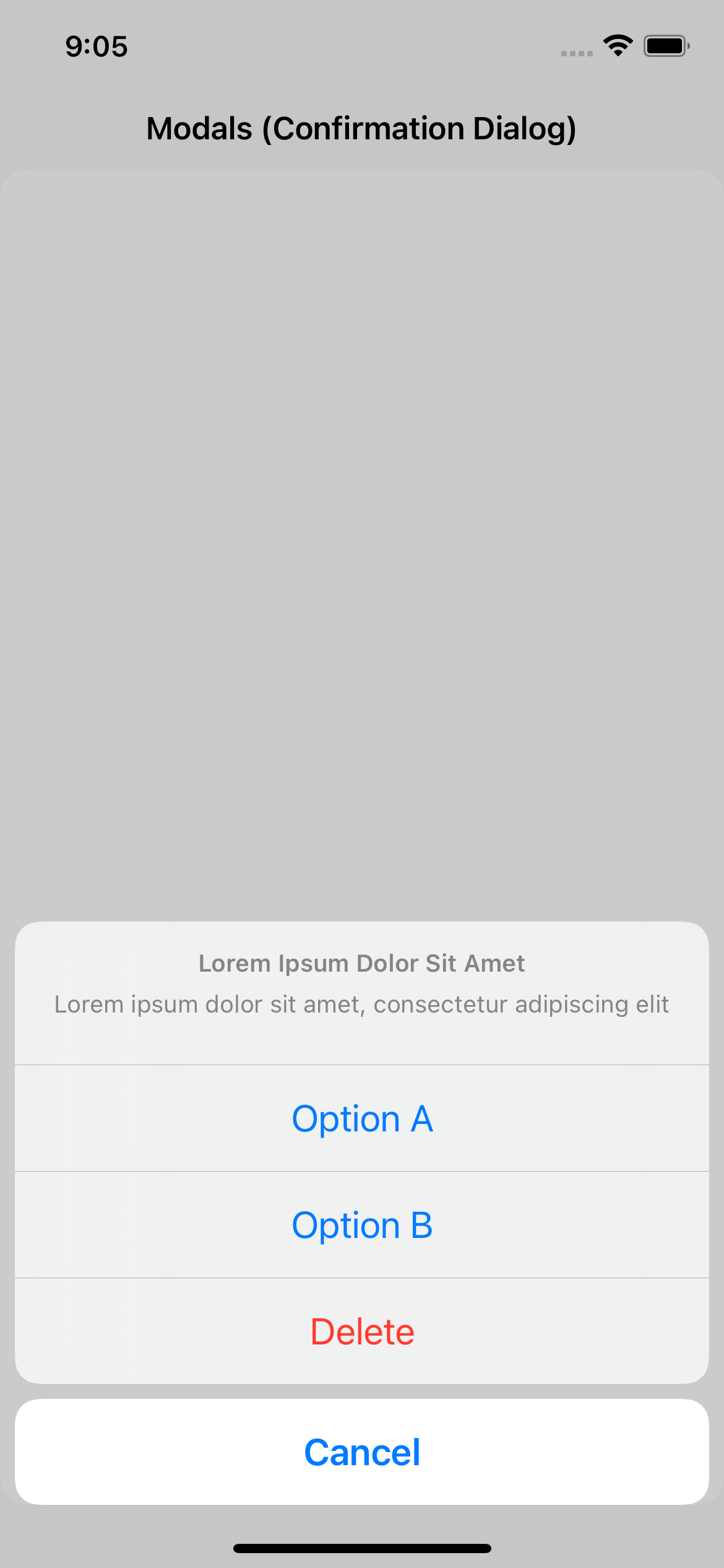
Modals. VModal, VBottomSheet, VSideBar, VAlert, VConfirmationDialog, VMenu
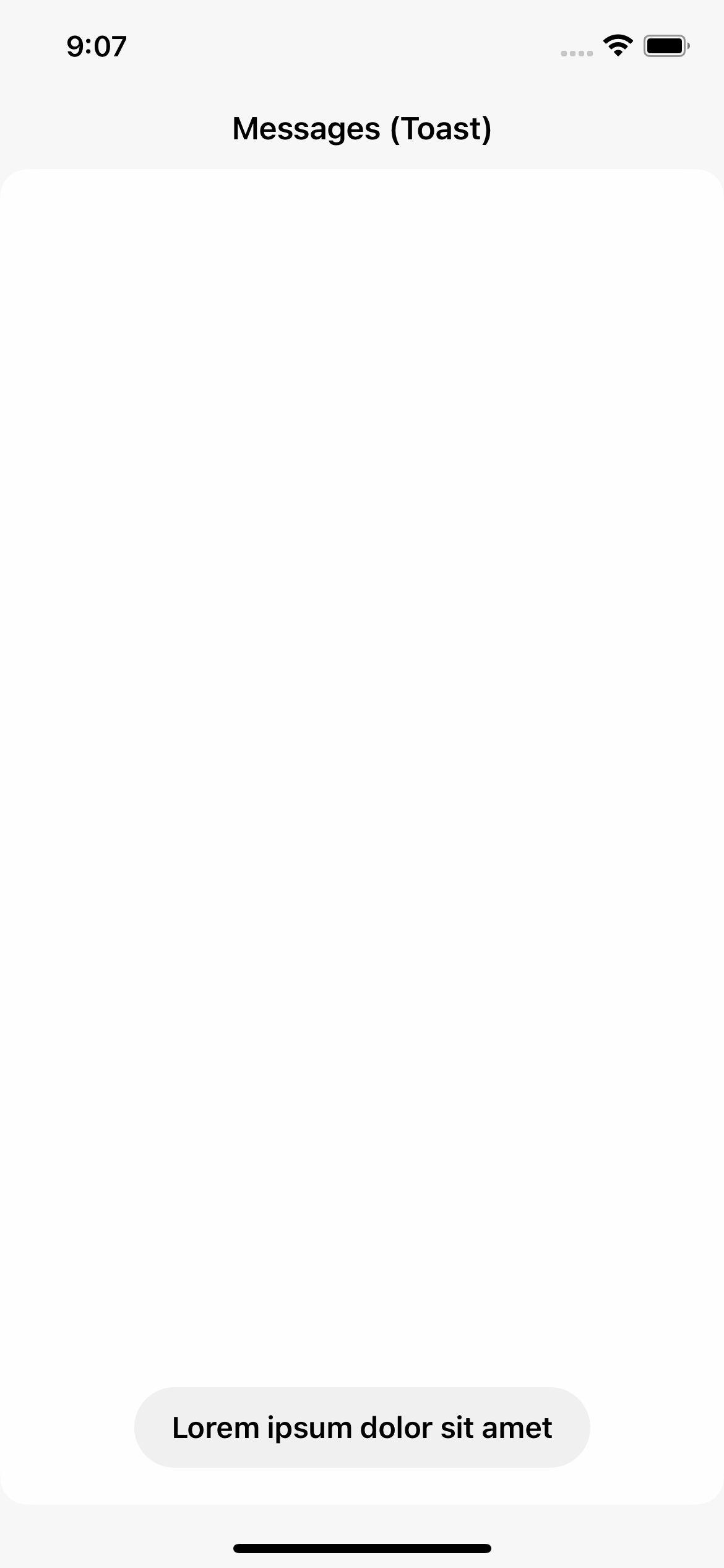
Messages. VToast

Indicators. VSpinner, VProgressBar, VPageIndicator

Misc. VText

Brand Book

Guidelines

Models

Components are not meant to be customized like you would a native SwiftUI component.

Instead, model can be passed as parameter to initializers. This parameter has default value, and is not required every time you create a view.

Models are structs with default values. They break down into 5 sub-structs: Layout, Colors, Fonts, Animations, and Misc.

For instance, changing foreground color of VSecondaryButton can be done by passing a model.

Not Preferred:

var body: some View {
    VSecondaryButton(
        action: doSomething,
        title: "Lorem ipsum"
    )
        .foregroundColor(.black)
}

Preferred:

let model: VSecondaryButtonModel = {
    var model: VSecondaryButtonModel = .init()
    
    model.colors.textContent = .init(
        enabled: .black,
        pressed: .gray,
        disabled: .gray
    )
    
    return model
}()

var body: some View {
    VSecondaryButton(
        model: model,
        action: doSomething,
        title: "Lorem ipsum"
    )
}

Alternately, you can create static instances of models for reusability.

extension VSecondaryButtonModel {
    static let someModel: VSecondaryButtonModel = {
        var model: VSecondaryButtonModel = .init()
        
        model.colors.textContent = .init(
            enabled: .black,
            pressed: .gray,
            disabled: .gray
        )
        
        return model
    }()
}

var body: some View {
    VSecondaryButton(
        model: .someModel,
        action: doSomething,
        title: "Lorem ipsum"
    )
}

Types

Some components take type as parameter. Types are represented as enums, as more can be added in the future.

For instance, VPageIndicator has three types: Finite, Infinite, and Auto. Unlike models, types may be required in some instances. For other enums, a default case is provided.

var body: some View {
    VStack(content: {
        VPageIndicator(type: .finite, total: 9, selectedIndex: 4)
        
        VPageIndicator(type: .infinite(), total: 99, selectedIndex: 4)
        
        VPageIndicator(type: .auto(), total: 99, selectedIndex: 4)
    })
}

Some enums can also contain additional cases, such as focused for VBaseTextField and VTextField.

Animations

VComponents approaches animations as bound to components and their models, and not to state. Which means, that to modify a state of component with an animation, you need to pass a custom model.

Not Preferred:

@State var isOn: Bool = false

var body: some View {
    VStack(content: {
        VToggle(isOn: $isOn, title: "Lorem ipsum")
        
        VSecondaryButton(
            action: { withAnimation(nil, { isOn.toggle() }) },
            title: "Toggle"
        )
    })
}

Preferred:

@State var isOn: Bool = false

let model: VToggleModel = {
    var model: VToggleModel = .init()
    model.animations.stateChange = nil
    return model
}()

var body: some View {
    VStack(content: {
        VToggle(model: model, isOn: $isOn, title: "Lorem ipsum")
        
        VSecondaryButton(
            action: { isOn.toggle() },
            title: "Toggle"
        )
    })
}

First method is not only not preferred, but it will also not work. Despite specifying nil to change state, VToggle would still use its default animation.

Components manage state parameters internally, and animations used to change them externally do not have any effect.

Thought process behind his design choice was to centralize animations to model.

Components also prevent themselves from modifying external state with an animation.

Demo

Project contains demo app, that can be run to showcase all components.

Installation

Swift Package Manager

Add https://github.com/VakhoKontridze/VComponents as a Swift Package in Xcode and follow the instructions.

Versioning

Major. Major changes, such as big overhauls

Minor. Minor changes, such as new component, types, or properties in models

Patch. Bug fixes and improvements

Contact

e-mail: vakho.kontridze@gmail.com

Description

  • Swift Tools 5.6.0
View More Packages from this Author

Dependencies

Last updated: Tue Apr 16 2024 12:16:26 GMT-0900 (Hawaii-Aleutian Daylight Time)