

Easily extend any project to include an intelligent design component browser.

Y—Component Browser is licensed under the Apache 2.0 license.
Documentation is automatically generated from source code comments and rendered as a static website hosted via GitHub Pages at: https://yml-org.github.io/YComponentBrowser/
A category is a collection of components that share common traits. A category may contain subcategories. By default, components are laid out in nested table views, with each component being represented by a single row. A CatalogDisplayView is used to display a component in a single row. It displays small components together with a title and optional detail description. This is used for icons, fonts, and colors, but also works well for smaller components such as buttons. By using generics, CatalogDisplayView can display any view (populated with an associated model). The framework includes pre-defined categories for displaying common components: colors, fonts, and icons.
The catalog display view model has four parameters:
title: titledetail: detail description (optional), defaults tonilaxis: primary axis for the content view, defaults to.horizontalmodel: model to populate the content view
By using CustomCategory, a larger component, such as a card view, can be shown. Each custom component might occupy a full row by itself.
For even larger components such as a view controller, we may skip the table view controller and display the component on a full screen by itself. This is accomplished by defining a custom category and destination that conform to the Classification and Destination protocols, respectively.
We can display colors by declaring a ColorCategory object:
let category = ColorCategory(
    name: "Easter",
    models: [
        .init(
            title: "Purple",
            detail: "HEX: #D9D7F1",
            model: UIColor(red: 217/255, green: 215/255, blue: 241/255, alpha: 1)
        ),
        .init(
            title: "Light Yellow",
            detail: "HEX: #FFFDDE",
            model: UIColor(red: 1, green: 253/255, blue: 222/255, alpha: 1)
        )
    ]
)
where you need to specify:
name: color category namemodels: information about the colors to be displayed

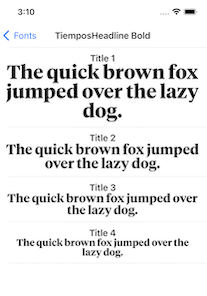
We can display fonts by declaring a FontCategory object:
let category = FontCategory(
    name: "TiemposHeadline Bold",
    models: [
        .init(
            title: "Title 1",
            model: FontView.Model(
                font: UIFont(name: "TiemposHeadline-Bold", size: 36)!
            )
        ),
        .init(
            title: "Title 2",
            model: FontView.Model(
                font: UIFont(name: "TiemposHeadline-Bold", size: 26)!
            )
        )
    ]
)
where you need to specify:
name: font category namemodels: information about the fonts to be displayed
We can display icons by declaring an IconCategory object:
let category = IconCategory(
    name: "Media",
    models: [
        .init(
            title: "Play",
            model: UIImage(systemName: "play.fill")!
        ),
        .init(
            title: "Pause",
            model: UIImage(systemName: "pause.fill")!
        )
    ]
)
where you need to specify:
name: icon category namemodels: information about the icons to be displayed

We can display nested subcategories by declaring a CatalogCategory object:
let category = CatalogCategory(
    name: "Foundational",
    subcategories: [
        ColorSample.category,
        IconSample.category,
        FontSample.category
    ]
)
where you need to specify:
name: category namesubcategories: array of subcategories

We can display small custom components (such as buttons) by declaring a CustomCategory object that leverages CatalogDisplayView:
let category = CustomCategory<CatalogDisplayView<DemoButton>>(
    name: "Demo Button",
    models: [
        .init(
            title: "Login",
            model: .init(
                backgroundColor: .systemBlue,
                title: "Login",
                titleColor: .white
            )
        ),
        .init(
            title: "Logout",
            model: .init(
                backgroundColor: .systemRed,
                cornerRadius: 25,
                title: "Logout",
                titleColor: .white
            )
        ),
    ]
)
where you need to specify:
name: category namemodels: information about the components to be displayed (in this case buttons)

We can display medium-sized custom components (such as a card or a note) by declaring a CustomCategory object that directly uses the view to be displayed:
let category = CustomCategory<NoteView>(
    name: "Demo View",
    models: [
        NoteView.Model(
            title: "Grocery List",
            body: "1) apples\n 2) sugar\n 3) coffee\n 4)snacks",
            backgroundColor: .systemYellow
        ),
        NoteView.Model(
            title: "Todo List",
            body: ""1)Buy Grocery\n 2)Prepare meal\n 3) Call a friend\n "",
            backgroundColor: .systemYellow
        )
    ]
)
where you need to specify:
name: category namemodels: information about the components to be displayed (in this case notes)

In order to display large custom components (including full-screen views and even view controllers), we need to:
- Create a custom destination that returns a view controller to be presented. If your component is not a view controller, this would be a view controller that contains your component.
struct CarouselDestination: Destination {
    let navigationTitle: String?

    let presentationStyle: Presentation = .detail

    func getDestinationController() -> UIViewController {
        CarouselDemoViewController(navigationTitle: navigationTitle)
    }
}
- Create a custom category for that particular view controller
struct CarouselCategory: Classification {
    let name: String

    var destination: Destination {
        CarouselDestination(navigationTitle: name)
    }
}
- Declare an instance of the category
let category = CarouselCategory(name: "Carousel Demo View Controller")

We utilize semantic versioning.
{major}.{minor}.{patch}
e.g.
1.0.5
We utilize a simplified branching strategy for our frameworks.
- main (and development) branch is
main - both feature (and bugfix) branches branch off of
main - feature (and bugfix) branches are merged back into
mainas they are completed and approved. maingets tagged with an updated version # for each release
feature/{ticket-number}-{short-description}
bugfix/{ticket-number}-{short-description}
e.g.
feature/CM-44-button
bugfix/CM-236-textview-color
Prior to submitting a pull request you should:
- Compile and ensure there are no warnings and no errors (this includes warnings from SwiftLint).
- Run all unit tests and confirm that everything passes.
- Check unit test coverage and confirm that all new / modified code is fully covered.
- Run
jazzyfrom the command line and confirm that you have 100% documentation coverage. - Consider using
git rebase -i HEAD~{commit-count}to squash your last {commit-count} commits together into functional chunks. - If HEAD of the parent branch (typically
main) has been updated since you created your branch, usegit rebase mainto rebase your branch.- Never merge the parent branch into your branch.
- Always rebase your branch off of the parent branch.
When submitting a pull request:
- Use the provided pull request template and populate the Introduction, Purpose, and Scope fields at a minimum.
- If you're submitting before and after screenshots, movies, or GIF's, enter them in a two-column table so that they can be viewed side-by-side.
When merging a pull request:
- Make sure the branch is rebased (not merged) off of the latest HEAD from the parent branch. This keeps our git history easy to read and understand.
- Make sure the branch is deleted upon merge (should be automatic).
- Tag the corresponding commit with the new version (e.g.
1.0.5) - Push the local tag to remote
brew install swiftlint
sudo gem install jazzy
Open Package.swift in Xcode.
You can generate your own local set of documentation directly from the source code using the following command from Terminal:
jazzy
This generates a set of documentation under /docs. The default configuration is set in the default config file .jazzy.yaml file.
To view additional documentation options type:
jazzy --help
A GitHub Action automatically runs each time a commit is pushed to main that runs Jazzy to generate the documentation for our GitHub page at: https://yml-org.github.io/YComponentBrowser/