MHHalfSheet


An easy to use ViewModifier for presenting and dimiss a half sheet modal.
Install
MHHalfSheet is available via Swift Package Manager. To install, search https://github.com/markchous/MHHalfSheet in your Swift Package Manager in your Project settings. Main branch will always be the most up-to-date and stable version of the framework.
Details
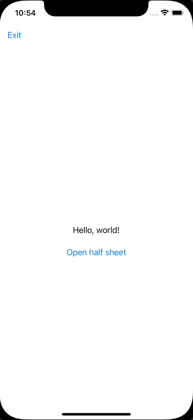
Here is an example of a default half sheet modal using the DefaultStyle included in the framework if you choose to not customize it.

The half sheet modal ViewModifier takes in three parameters.
- A Binding that determines if the half sheet modal is presented or not.
- An optional
HalfSheetStylethat determines the customization fo your half sheet modal. It will useDefaultStyleif nil. - A
ViewBuilderclosure that returns the view to embed in the half sheet modal.
To use it properly add the modifier to the parent view of your screen as shown below.
var body: some View {
      VStack {
          ...
      }
      .halfSheet(isPresented: $isHalfModalSheetPresented) {
          TestInfoView()
      }
  }
$isPresented can be apart of your view or your view model. For this example is apart of my view as a @State property as such.
struct ContentView: View {
  @State var isHalfModalSheetPresented = false

  ...

}
It is default to false so that the half sheet modal is not presented by default. Use as needed per your project requirements.
TestInfoView() is the View I want to embed in the half sheet modal.
Note: I have not assigned a style and left it as nil when creating my modifier so it will take on the DefaultStyle.
To customize your half sheet modal, inherit the HalfSheetStyle protocol as shown below. Note: these are only some of the properties you can set. Please look at HalfSheetStyle.swift for a full list of options.
struct TestStyle: HalfSheetStyle {
  var overlayColor: Color {
      .blue
  }

  var backgroundColor: Color {
      .mint
  }

  var dragOffset: CGFloat {
      100
  }

  var padding: CGFloat {
      24
  }

  var disableCardView: Bool {
      true
  }

  var disableDragDismiss: Bool {
      true
  }
}

struct ContentView: View {
  @State var isHalfModalSheetPresented = false

  var body: some View {
      VStack {
          ...
      }
      .halfSheet(isPresented: $isHalfModalSheetPresented, style: TestStyle()) {
          TestInfoView()
      }
  }
}
To present the half modal sheet, simply assign isHalfModalSheet to true or call isHalfModalSheet.toggle()
Things to be aware of
If you are using a NavigationView, the ToolBar items will be on top of the overlay when the half sheet modal is presented. Whichs means they're tappable. If you do not want them to be tappable I suggest the following implementation.
Use your variable that captures the presented state of the half sheet modal to toggle if the ToolBarItems are disabled. I use isHalfModalSheetPresented in this example.
var body: some View {
      VStack {
          ...
      }
      .toolbar {
          ToolbarItem(placement: .navigationBarLeading) {
              Button("Exit") {
                  print("exit tapped")
              }
              .disabled(isHalfModalSheetPresented)
          }
      }
      .halfSheet(isPresented: $isHalfModalSheetPresented) {
          TestInfoView()
      }
  }
License
Distributed under the MIT license. See LICENSE for more information.