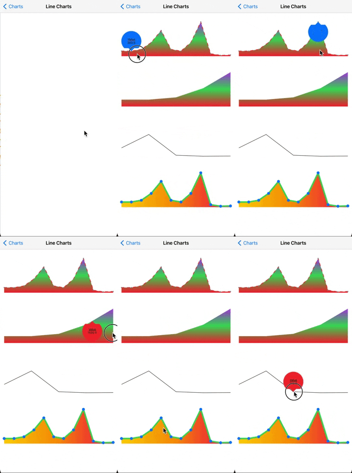
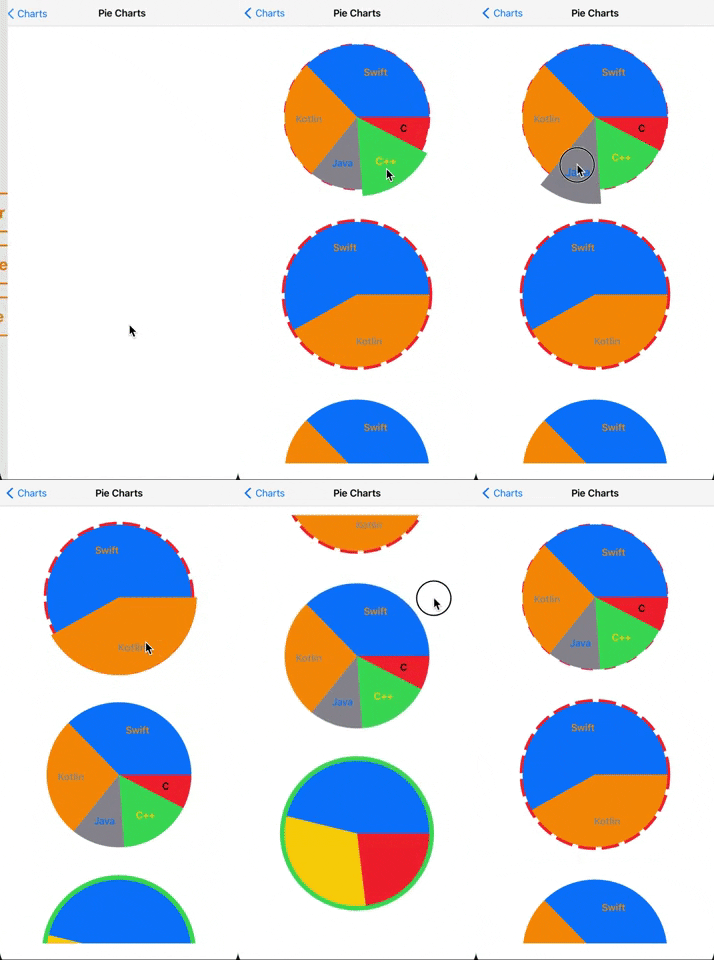
BIKCharts is a new chart framework for iOS +13. There are different types of Charts like BarChart, LineChart, PieChart. There are lots of configurable options for these charts. All chart models are ObservableObject and these properties have publisher. So you can easily change your model dynamically.
- Pure SwiftUI
- Dynamic
- Animatable
- Tooltip support
- Configurable
- Easy to implement and use
- iOS +13
Use Swift Package Manager and add package dependency
https://github.com/ilyadaberdil/BIKCharts.git
Create BarChartModel to configure your charts.
(Some of these properties have default value but you can configure as you wish)
// Sample titles and values for BarChartModel
let values: [CGFloat] = [300, 300, 400, 800, 1500, 400, 300, 800, 2000, 144, 53, 71]
let titles: [String] = ["Jan", "Feb", "Mar", "Apr", "May", "Jun", "Jul", "Aug", "Sep", "Oct", "Nov", "Dec"]

let model = BarChartModel(data: values,
                          dataDescriptions: titles,
                          calculationType: .maxValue,
                          barSpacing: 16,
                          fillBarColor: .green,
                          emptyBarColor: .gray,
                          barCornerRadius: .zero,
                          showValueText: false,
                          showValueDescription: true,
                          isBadgeViewEnabled: true,
                          badgeViewModel: BadgeValueModel(showUnderline: true,
                                                          underlineColor: .red,
                                                          title: "Value",
                                                          foregroundColor: .purple),
                          direction: .vertical)
That's all 🎉
If you want to implement your custom dragAction, you can use this callBack;
BarChart(with: model, dragAction: { (value) in
  print(value)
})
.frame(width: 350, height: 250)Create LineChartModel to configure your charts.
(Some of these properties have default value but you can configure as you wish)
// Sample values for LineChartModel
let values: [CGFloat] = [300, 300, 400, 800, 1500, 400, 300, 800, 2000, 144, 53, 71]

let model = LineChartModel(data: values,
                           calculationStyle: .maxValue,
                           lineWidth: 2,
                           showPoints: true,
                           lineColor: .red,
                           pointColor: .gray,
                           fillWithLinearGradient: LinearGradient(gradient: Gradient(colors: [.red, .green, .purple]),
                                                                  startPoint: .bottom,
                                                                  endPoint: .top),
                           showLineWhenFilled: true,
                           dashOfLine: [10],
                           isBadgeViewEnabled: true,
                           badgeViewModel: BadgeValueModel(showUnderline: true,
                                                           underlineColor: .red,
                                                           title: "Value",
                                                           foregroundColor: .blue))
That's all 🎉
If you want to implement your custom dragAction, you can use this callBack;
LineChart(with: model, dragAction: { (value) in
  print(value)
})
.frame(height: 120)Create PieChartModel to configure your charts.
(Some of these properties have default value but you can configure as you wish)
// Sample pieChartDataList for PieChartModel
  let pieChartDataList: [PieChartData] = [.init(slice: .init(value: 35, color: .red),
                                                              titleConfiguration: .init(title: "C",
                                                                                        foregroundColor: .black,
                                                                                        font: .headline)),
                                                        .init(slice: .init(value: 75, color: .green),
                                                              titleConfiguration: .init(title: "C++",
                                                                                        foregroundColor: .yellow,
                                                                                        font: .headline)),
                                                        .init(slice: .init(value: 55, color: .gray),
                                                              titleConfiguration: .init(title: "Java",
                                                                                        foregroundColor: .blue,
                                                                                        font: .headline)),
                                                        .init(slice: .init(value: 124, color: .orange),
                                                              titleConfiguration: .init(title: "Kotlin",
                                                                                        foregroundColor: .gray,
                                                                                        font: .headline)),
                                                        .init(slice: .init(value: 172, color: .blue),
                                                              titleConfiguration: .init(title: "Swift",
                                                                                        foregroundColor: .orange,
                                                                                 font: .headline))]

    let model = PieChartModel(data: pieChartDataList,
                                    borderStyle: BorderStyle(circumferenceBorderStrokeStyle: .init(lineWidth: 3,
                                                                                                   lineCap: .butt,
                                                                                                   lineJoin: .bevel,
                                                                                                   dash: [20]),
                                                             circumferenceBorderColor: .pink))
That's all 🎉
If you want to implement your custom tapAction, you can use this callBack;
PieChart(viewModel: model, tapAction: { (data) in
  print(data)
})
.frame(height: 250)

