TTProgressHUD
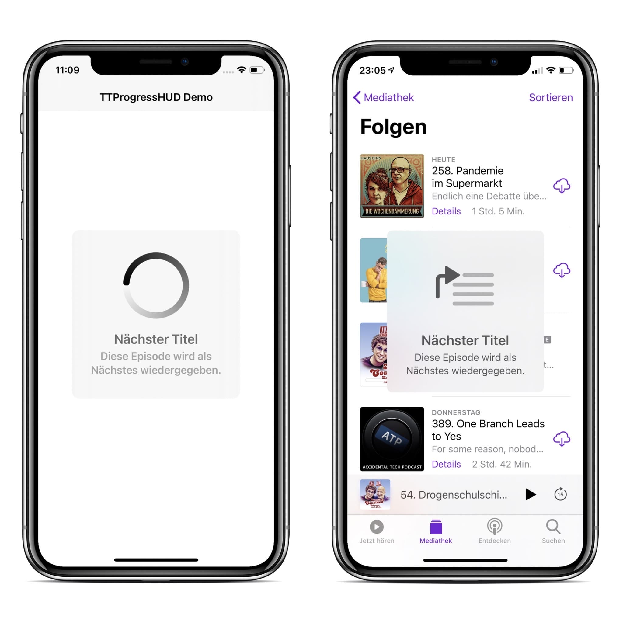
TTProgressHUD is a light weight HUD written in SwiftUI meant to display the progress of an ongoing task on iOS. TTProgressHUD (left) was designed to look as similar as possible to the Apple HUD (example from Podcast.app, right).
Installation
Xcode 11 and iOS 13 is required.
Swift Package Manager
- Xcode: File -> Swift Packages -> Add Package Dependenc
- Paste https://github.com/honkmaster/TTProgressHUD
Manually
Drag TTProgressHUD.swift and TTProgressHUDConfig.swift into your project.
Usage
Use TTProgressHUD wisely! Only use it if you absolutely need to perform a task before taking the user forward. Bad use case examples: pull to refresh, infinite scrolling, sending message.
Import
Import the TTProgressHUD package:
import TTProgressHUDInstantiate and show the HUD view
struct ContentView: View {
    @State var hudVisible = true
    @State var hudConfig = TTProgressHUDConfig()

    var body: some View {
        TTProgressHUD($hudVisible, config: hudConfig)
    }
}
Customization
TTProgressHUD can be customized via the TTProgressHUDConfig struct.
The default values were chosen so that TTProgressHUD looks as similar as possible to the Apple HUD.
public init(type:TTProgressHUDType         = .Loading,
            title:String?                  = nil,
            caption:String?                = nil,
            minSize:CGSize                 = CGSize(width: 100.0, height: 100.0),
            cornerRadius:CGFloat           = 12.0,
            backgroundColor:Color          = .clear,
            titleForegroundColor:Color     = .primary,
            captionForegroundColor:Color   = .secondary,
            shadowColor:Color              = .clear,
            shadowRadius:CGFloat           = 0.0,
            borderColor:Color              = .clear,
            borderWidth:CGFloat            = 0.0,
            lineWidth:CGFloat              = 10.0,
            imageViewSize:CGSize           = CGSize(width: 100, height: 100), // indefinite animated view and image share the size
            imageViewForegroundColor:Color = .primary,                        // indefinite animated view and image share the color
            successImage:String            = "checkmark.circle",
            warningImage:String            = "exclamationmark.circle",
            errorImage:String              = "xmark.circle",
            shouldAutoHide:Bool            = false,
            allowTapToHide:Bool            = false,
            autoHideInterval: TimeInterval = 10.0,
            hapticsEnabled:Bool            = true){...}
Haptic Feedback
TTProgressHUD will automatically trigger haptic feedback depending on which HUD is being displayed. The feedback maps as follows:
TTProgressHUDType.Success<->UINotificationFeedbackTypeSuccessTTProgressHUDType.Error<->UINotificationFeedbackTypeWarningTTProgressHUDType.Warning<->UINotificationFeedbackTypeError
Contributing to this project
If you have feature requests or bug reports, feel free to help out by sending pull requests or by creating new issues. Please take a moment to review the guidelines written by Nicolas Gallagher:
License
TTProgressHUD is distributed under the terms and conditions of the MIT license.
Credits
TTProgressHUD is brought to you by Tobias Tiemerding and based on SVProgressHUD. If you're using TTProgressHUD in your project, attribution would be very appreciated.
