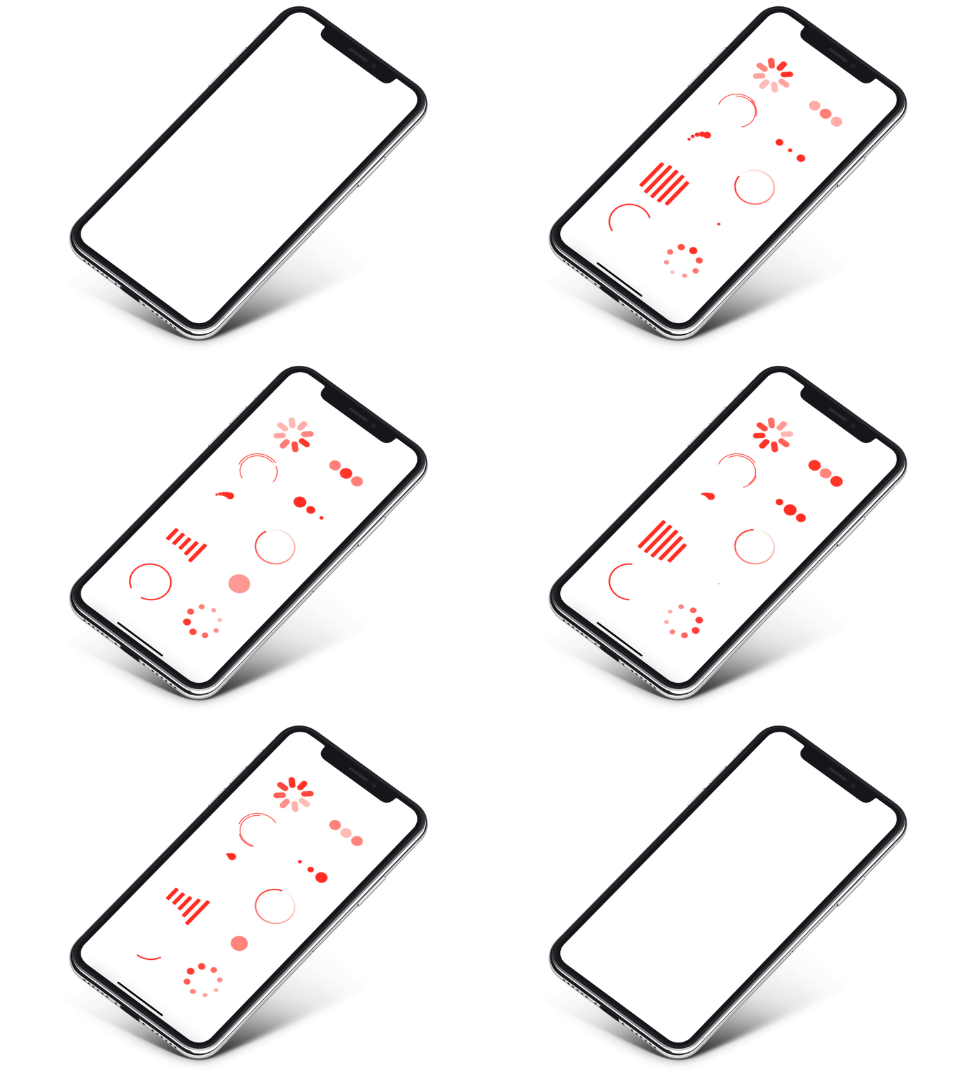
Create an indicator like this:
ActivityIndicatorView(isVisible: $showLoadingIndicator, type: .default)where
showLoadingIndicator - bool value you may change to display or hide the indicator
type - value from ActivityIndicatorView.IndicatorType enum
You may alter it with standard SwiftUI means like this:
ActivityIndicatorView(isVisible: $showLoadingIndicator, type: .default)
     .frame(width: 50.0, height: 50.0)
     .foregroundColor(.red)
Or specify another indicator type:
ActivityIndicatorView(isVisible: $showLoadingIndicator, type: .growingArc(.red, lineWidth: 4))
.frame(width: 50.0, height: 50.0)Each indicator type has a number of parameters that have reasonable defaults. You can change them as you see fit, but it is advised to not set them too high or too low.
default - iOS UIActivityIndicator style
.default(count: 8)arcs
.arcs(count: 3, lineWidth: 2)rotatingDots
.rotatingDots(count: 5)flickeringDots
.flickeringDots(count: 8)scalingDots
.scalingDots(count: 3, inset: 2)opacityDots
.opacityDots(count: 3, inset: 4)equalizer
.equalizer(count: 5)growingArc - add custom color for growing Arc, the default value is Color.black
.growingArc(.red, lineWidth: 4)growingCircle - no parameters
gradient - circle with angular gradient border stroke, pass colors like this:
.gradient([.white, .red], lineWidth: 4)To try ActivityIndicatorView examples:
- Clone the repo
https://github.com/exyte/ActivityIndicatorView.git - Open
ActivityIndicatorViewExample.xcodeproj - Try it!
dependencies: [
    .package(url: "https://github.com/exyte/ActivityIndicatorView.git")
]- iOS 13+ / watchOS 6+ / tvOS 13+ / macOS 10.15+
- Xcode 11+
PopupView - Toasts and popups library
AnchoredPopup - Anchored Popup grows "out" of a trigger view (similar to Hero animation)
Grid - The most powerful Grid container
ScalingHeaderScrollView - A scroll view with a sticky header which shrinks as you scroll
AnimatedTabBar - A tabbar with a number of preset animations
MediaPicker - Customizable media picker
Chat - Chat UI framework with fully customizable message cells, input view, and a built-in media picker
OpenAI Wrapper lib for OpenAI REST API
AnimatedGradient - Animated linear gradient
ConcentricOnboarding - Animated onboarding flow
FloatingButton - Floating button menu
ProgressIndicatorView - A number of animated progress indicators
FlagAndCountryCode - Phone codes and flags for every country
SVGView - SVG parser
LiquidSwipe - Liquid navigation animation


