


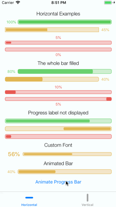
GTProgressBar is a customisable progress bar. It supports both vertical and horizontal orientation, You can adjust many visual settings of the progress bar to suit your use case. Customisation can be done in both the Interface Builder and in code. Here is a preview from the example app:
To run the example project, clone the repo, and run pod install from the Example directory first.
This component is written using Swift 5 so you will need to run Xcode 11 or higher.
Many properties of GTProgressBar can be configured. Most of them can be configured in Interface Builder (@IBInspectable).
-
orientation: GTProgressBarOrientationThis property allows you to specify the orientation of the bar:horizontalorvertical. By default it is set to horizontalprogressBar.orientation = GTProgressBarOrientation.vertical
-
@IBInspectable orientationInt: IntThis property allows you to specify the orientation of the bar as Int. It defaults to horizontal. Current mapping is0 ->
GTProgressBarOrientation.horizontal1 ->
GTProgressBarOrientation.verticalprogressBar.orientationInt = 1
-
direction: GTProgressBarDirectionThis property allows you to specify the direction of the progress bar content:clockwiseoranticlockwise. By default it is set to clockwiseprogressBar.direction = GTProgressBarDirection.anticlockwise
-
@IBInspectable directionInt: IntThis property allows you to specify the direction of the progress bar content as Int. It defaults to clockwise. Current mapping is0 ->
GTProgressBarDirection.clockwise1 ->
GTProgressBarDirection.anticlockwiseprogressBar.orientationInt = 1
-
@IBInspectable progress: CGFloatThis property specifies how much of the bar is filled. The allowed values are from 0.0 to 1.0 . Default is 0. If progress label is displayed the value provided in here will be displayed as % The following example will cause 50% of the bar to be filled. The label will show 50%
progressBar.progress = 0.5
-
@IBInspectable displayLabel: BoolThis property specifies if the progress label should be displayed. Default is
true.progressBar.displayLabel = false
-
@IBInspectable barBorderColor: UIColorThis property specifies the colour of the bar's border. Default is
UIColor.blackprogressBar.barBorderColor = UIColor(red:0.35, green:0.80, blue:0.36, alpha:1.0)
-
@IBInspectable barBackgroundColor: UIColorThis property specifies the background colour of the progress bar within the control. Default is
UIColor.whiteprogressBar.barBackgroundColor = UIColor(red:0.77, green:0.93, blue:0.78, alpha:1.0)
-
@IBInspectable barFillColor: UIColorThis property specifies the fill colour of the progress bar. Default is UIColor.white
progressBar.barFillColor = UIColor(red:0.35, green:0.80, blue:0.36, alpha:1.0)
-
@IBInspectable barBorderWidth: CGFloatThis property specifies the width of the progress bar's border. Default is 2
progressBar.barBorderWidth = 1
-
@IBInspectable barFillInset: CGFloatThis property specifies the inset between the fill of the bar and its border. Default is 2
progressBar.barFillInset = 1
-
@IBInspectable labelTextColor: UIColorThis property specifies the fill colour of the label. Default is
UIColor.blackprogressBar.labelTextColor = UIColor(red:0.35, green:0.80, blue:0.36, alpha:1.0)
-
progressLabelInsets: UIEdgeInsetsThis property specifies the insets for the progress label. Default is
UIEdgeInsets(top: 0, left: 5, bottom: 0, right: 5)progressBar.progressLabelInsets = UIEdgeInsets(top: 0, left: 5, bottom: 0, right: 5)
-
@IBInspectable progressLabelInsetLeft: CGFloatThis property allows you to specify the left property of the progressLabelInsets in the Interface Builder. Default is 0.
progressBar.progressLabelInsetLeft = 5.0
-
@IBInspectable progressLabelInsetRight: CGFloatThis property allows you to specify the right property of the progressLabelInsets in the Interface Builder. Default is 0.
progressBar.progressLabelInsetRight = 5.0
-
@IBInspectable progressLabelInsetTop: CGFloatThis property allows you to specify the top property of the progressLabelInsets in the Interface Builder. Default is 0.
progressBar.progressLabelInsetTop = 5.0
-
@IBInspectable progressLabelInsetBottom: CGFloatThis property allows you to specify the bottom property of the progressLabelInsets in the Interface Builder. Default is 0.
progressBar.progressLabelInsetBottom = 5.0
-
@IBInspectable cornerRadius: CGFloatThis property specifies the radius of corners. Default is 0.0
progressBar.cornerRadius = 10.0
-
font: UIFontThis property allows you to specify the font for the progress label. Default is
UIFont.systemFont(ofSize: 12)progressBar.font = UIFont.boldSystemFont(ofSize: 18)
-
barMaxHeight: CGFloat?This property allows you to specify the max height of the progress bar. By default the progress bar will be sized to match the height of the whole view. If the max height is larger than the available view height it will be ignored.
progressBar.barMaxHeight = 12
-
@IBInspectable barMaxHeightInt: IntThis property allows you to specify the max height of the progress bar as an integer in the Interface Builder. By default the progress bar will be sized to match the height of the whole view. If the max height is larger than the available view height it will be ignored. If you set this property to 0 there will be no restriction on the height of the bar.
progressBar.barMaxHeightInt = 12
-
barMaxWidth: CGFloat?This property allows you to specify the max width of the progress bar. By default the progress bar will be sized to match the available free width. If the max width is larger than the available width it will be ignored.
progressBar.barMaxWidth = 12
-
@IBInspectable barMaxWidthInt: IntThis property allows you to specify the max width of the progress bar as an integer in the Interface Builder. By default the progress bar will be sized to match the available free width. If the max width is larger than the available width it will be ignored. If you set this property to 0 there will be no restriction on the width of the bar.
progressBar.barMaxWidthInt = 12
-
labelPosition: GTProgressBarLabelPositionThis property allows you to specify on which side the progress label should be placed. Default is
GTProgressBarLabelPosition.leftprogressBar.labelPosition = GTProgressBarLabelPosition.right
-
@IBInspectable labelPositionInt: IntThis property allows you to specify the position of the progress label using integers in the Interface Builder. Current mapping is
0 ->
GTProgressBarLabelPosition.left1 ->
GTProgressBarLabelPosition.right2 ->
GTProgressBarLabelPosition.top3 ->
GTProgressBarLabelPosition.bottomprogressBar.labelPosition = GTProgressBarLabelPosition.right
-
cornerType: GTProgressBarCornerTypeThis property allows you to specify the type of the corner (square or rounded). Default is
GTProgressBarCornerType.roundedprogressBar.cornerType = GTProgressBarCornerType.square
-
@IBInspectable cornerTypeInt: IntThis property allows you to specify the type of the corner using integers in the Interface Builder. Current mapping is
0 ->
GTProgressBarCornerType.square1 ->
GTProgressBarCornerType.roundedprogressBar.cornerTypeInt = GTProgressBarCornerType.rounded.rawValue
-
animateTo(progress: CGFloat, completion: (() -> Void)?)This method animates the progress bar to the value specified. The allowed values are from 0.0 to 1.0 . If invalid value is provided it will be capped to the nearest allowed value. This method also accepts a completion callback executed when the animation completes.
progressBar.animateTo(progress: 0.9) {
  print("Animation completed")
}
To put it altogether here is an example configuration of GTProgressBar in code:
let progressBar = GTProgressBar(frame: CGRect(x: 0, y: 0, width: 300, height: 15))
progressBar.progress = 1
progressBar.barBorderColor = UIColor(red:0.35, green:0.80, blue:0.36, alpha:1.0)
progressBar.barFillColor = UIColor(red:0.35, green:0.80, blue:0.36, alpha:1.0)
progressBar.barBackgroundColor = UIColor(red:0.77, green:0.93, blue:0.78, alpha:1.0)
progressBar.barBorderWidth = 1
progressBar.barFillInset = 2
progressBar.labelTextColor = UIColor(red:0.35, green:0.80, blue:0.36, alpha:1.0)
progressBar.progressLabelInsets = UIEdgeInsets(top: 0, left: 5, bottom: 0, right: 5)
progressBar.font = UIFont.boldSystemFont(ofSize: 18)
progressBar.labelPosition = GTProgressBarLabelPosition.right
progressBar.barMaxHeight = 12
progressBar.direction = GTProgressBarDirection.anticlockwise

view.addSubview(progressBar)To install it, simply add the following line to your Cartfile:
github "gregttn/GTProgressBar"
To install it, simply add the following line to your Podfile:
pod "GTProgressBar"gregttn, gregttn@gmail.com
GTProgressBar is available under the MIT license. See the LICENSE file for more info.