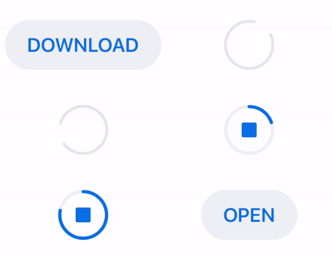
AHDownloadButton is a customizable download button similar to the download button in the latest version of Apple's App Store app (since iOS 11). It features download progress animation as well as animated transitions between download states: start download, pending, downloading and downloaded. You can find more details about the implementation on my blog.
- iOS 8.0+
- Xcode 10.2
- Swift 5.0
To use AHDownloadButton in code, you simply create a new instance and add it as a subview to your desired view:
  let downloadButton = AHDownloadButton()
  downloadButton.frame = CGRect(origin: origin, size: size)
  view.addSubview(downloadButton)
The button can have 4 different states:
startDownload- initial state before downloadingpending- state for preparing for downloaddownloading- state when the user is downloadingdownloaded- state when the user finished downloading
The state of the button can be changed through its state property.
You can use the AHDownloadButtonDelegate to monitor taps on the button and update button's state if needed. To update the current download progress, use the progress property. Here is an example how it could be implemented:
extension DownloadViewController: AHDownloadButtonDelegate {

    func downloadButton(_ downloadButton: AHDownloadButton, tappedWithState state: AHDownloadButton.State)
        switch state {
        case .startDownload:

            // set the download progress to 0
            downloadButton.progress = 0

            // change state to pending and wait for download to start
            downloadButton.state = .pending

            // initiate download and update state to .downloading
            startDownloadingFile()

        case .pending:

            // button tapped while in pending state
            break

        case .downloading:

            // button tapped while in downloading state - stop downloading
            downloadButton.progress = 0
            downloadButton.state = .startDownload

        case .downloaded:

            // file is downloaded and can be opened
            openDownloadedFile()

        }
    }
}
You can also use closures instead of the AHDownloadButtonDelegate by setting the didTapDownloadButtonAction and downloadButtonStateChangedAction properties.
AHDownloadButton can be customized. These are the properties that can be used for customizing the button:
-
Use the custom initializer
init(alignment: HorizontalAlignment)to set the horizontal alignment property.HorizontalAlignmentdetermines the position of the pending and downloading circles. The position can either becenter,leftorright. The default value iscenter. -
Customization properties when button is in
startDownloadstate:
startDownloadButtonTitle- button's titlestartDownloadButtonTitleFont- button's title fontstartDownloadButtonTitleSidePadding- padding for left and right side of button's titlestartDownloadButtonHighlightedBackgroundColor- background color for the button when it's in highlighted state (when the user presses the button)startDownloadButtonNonhighlightedBackgroundColor- background color for the button when it's in nonhighlighted state (when the button is not pressed)startDownloadButtonHighlightedTitleColor- title color for the button when it's in highlighted state (when the user presses the button)startDownloadButtonNonhighlightedTitleColor- title color for the button when it's in nonhighlighted state (when the button is not pressed)
- Customization properties when button is in
pendingstate:
pendingCircleColor- color of the pending circlependingCircleLineWidth- width of the pending circle
- Customization properties when button is in
downloadingstate:
downloadingButtonHighlightedTrackCircleColor- color for the track circle when it's in highlighted state (when the user presses the button)downloadingButtonNonhighlightedTrackCircleColor- color for the track circle when it's in nonhighlighted state (when the button is not pressed)downloadingButtonHighlightedProgressCircleColor- color for the progress circle when it's in highlighted state (when the user presses the button)downloadingButtonNonhighlightedProgressCircleColor- color for the progress circle when it's in nonhighlighted state (when the button is not pressed)downloadingButtonHighlightedStopViewColor- color for the stop view in the middle of the progress circle when it's in highlighted state (when the user presses the button)downloadingButtonNonhighlightedStopViewColor- color for the stop view in the middle of the progress circle when it's in nonhighlighted state (when the button is not pressed)downloadingButtonCircleLineWidth- width of the downloading circle
- Customization properties when button is in
downloadedstate:
downloadedButtonTitle- button's titledownloadedButtonTitleFont- button's title fontdownloadedButtonTitleSidePadding- padding for left and right side of button's titledownloadedButtonHighlightedBackgroundColor- background color for the button when it's in highlighted state (when the user presses the button)downloadedButtonNonhighlightedBackgroundColor- background color for the button when it's in nonhighlighted state (when the button is not pressed)downloadedButtonHighlightedTitleColor- title color for the button when it's in highlighted state (when the user presses the button)downloadedButtonNonhighlightedTitleColor- title color for the button when it's in nonhighlighted state (when the button is not pressed)
transitionAnimationDuration- animation duration between the different states of the button
AHDownloadButton in startDownload and downloaded states calculates its width based on button title. Use the startDownloadButtonTitleSidePadding and downloadedButtonTitleSidePadding properties to customise the width when the button is in the aforementioned states.
To run the example project, clone the repo, and run pod install from the Example directory first.
CocoaPods is a dependency manager for Cocoa projects. You can install it with the following command:
$ gem install cocoapodsTo integrate AHDownloadButton into your Xcode project using CocoaPods, specify it in your Podfile:
source 'https://github.com/CocoaPods/Specs.git'
platform :ios, '8.0'
use_frameworks!

target '<Your Target Name>' do
    pod 'AHDownloadButton'
end
Then, run the following command:
$ pod installAHDownloadButton is licensed under the MIT license. Check the LICENSE file for details.


