This is a package that I made that has a bunch of qualities of life.
- iOS 14, macOS 10.16, tvOS 14, or watchOS 6.7
- Swift 5.5+
- Xcode 12.5+
The preferred way of installing Mcrich23 Toolkit is via the Swift Package Manager.
- In Xcode, open your project and navigate to File → Add Packages...
- Paste the repository URL (
https://github.com/Mcrich23/Mcrich23-Toolkit) and click Next. - For Rules, select Up To Next Minor Version (With base version set to 0.6.1).
- Click Finish.
- Check Mcrich23-Toolkit
- Click Add To Project
SwiftUI View
A nice multiple filter UI that horizontally scrolls

 ScrollCapsuleMultiFilter(menuContent: .constant({ // Passes in the view for the plus button menu. Must use .constant() so that the view updates.
        VStack {
            ForEach(viewModel.filterOpt, id: \.self) { text in
                if !viewModel.filter.contains(text) {
                    Button {
                        viewModel.filter.append(text)
                    } label: {
                        Text(text)
                    }
                }
            }
        }}),
    opt: $viewModel.filterOpt, //Use an array that are the same options as in the menu
    selected: $viewModel.filter //An array of currently selected filters
)
SwiftUI View
A nice multiple filter UI that auto resizes
AdaptiveCapsuleMultiFilter(
    "Filter: ", // The label you want next to the capsule filters
    menuContent: .constant({ // Passes in the view for the plus button menu. Must use .constant() so that the view updates.
        VStack {
            ForEach(viewModel.filterOpt, id: \.self) { text in
                if !viewModel.filter.contains(text) {
                    Button {
                        viewModel.filter.append(text)
                    } label: {
                        Text(text)
                    }
                }
            }
        }}), opt: $viewModel.filterOpt, // Use an array that are the same options as in the menu selected:$viewModel.filter) // An array of currently selected filters
SwiftUI View
A screen for welcoming the user or presenting a What's New screen.


OnboardingScreen(
    titleIcon: .systemImage(named: "plus"), // An icon to go next to the title
    titleIconColor: .yellow, // Color for the icon next to the title
    title: "Hello World", // Title
    subtitle: "Lorem Ipsum", // Subtitle (leave blank for it to dissapear)
    cells: .individual([
        FeatureCell(
            image: .systemImage(named: "hand"), // An icon next to the cell
            imageColor: .red, // Color for the icon next to the cell
            title: "Title", // Title
            subtitle: "Subtitle" // Subtitle/Description (leave blank for it to dissapear)
        )
    ])
)
let steps = [ Text(NSLocalizedString("welcome title 1", comment: "")).font(.body),
              Text(NSLocalizedString("welcome title 2", comment: "")).font(.body),
              Text(NSLocalizedString("welcome title 3", comment: "")).font(.body),
              Text(NSLocalizedString("welcome title 4", comment: "")).font(.body)]

let indicationTypes = [
    StepperIndicationType
        .custom(CircledIconView(image: Image(systemName: "plus"), width: 50)),
        .custom(CircledIconView(image: Image(systemName: "hand.draw"), width: 50)),
        .custom(CircledIconView(image: Image(systemName: "hand.tap"), width: 50)),
        .custom(CircledIconView(image: Image(systemName: "eye"), width: 50))
]
...

OnboardingScreen<Content>(
   titleIcon: .systemImage(named: "plus"), // An icon to go next to the title
   titleIconColor: .yellow, // Color for the icon next to the title
   title: "Hello World", // Title
   subtitle: "Lorem Ipsum", // Subtitle (leave blank for it to dissapear)
   cells:
       .steps(
           StepperViewOnboarding(
               steps: steps, // All the steps for the onboarding
               indicationTypes: indicationTypes, // What goes next to the step text
               lineOptions: .custom(1, Colors.blue(.teal).rawValue) // All the different line options
           )
       )
)
See badrinathvm/StepperView for more info on the Steps function.
Alert
Default alerts for SwiftUI
SwiftUIAlert.show(title: "Hello Word!", //Alert Title
                    message: "Lorem Ipsum", //Alert Message
                    preferredStyle: .alert, //Style (alert or action sheet)
                    actions: [UIAlertAction(title: "Done", //Action Title
                                            style: .default, //Action Style (default, destructive, dismiss)
                                            handler: {_ in}) //Handler for choosing that action
                    ]
)
SwiftUIAlert.textfieldShow(title: "Test", //Alert Title
                            message: "Hello World!", //Alert Message
                            preferredStyle: .alert, //Style (alert or action sheet)
                            textfield: AlertTextfield(text: $text, //Textfield Text
                                                        placeholder: "", //Textfield Placeholder
                                                        clearButtonMode: .whileEditing, //When to show clear butt(always, whileEditing, unlessEditing, or never)
                                                        enablesReturnKeyAutomatically: true, //Show return key keyboard
                                                        disableAutocorrection: false, //Disable Autocorrection?
                                                        autocapitalization: .sentences, //Autocapitalization (nonsentances, allCharacter, or words)
                                                        keyboardType: .default, //The type of keyboard
                                                        returnKeyType: .default, //Type of return key on keyboard
                                                        isSecureTextEntry: .no, //Is Secure Textfield? (.yes(UITextInputPassordRules) or .no)
                                                        dismissKeyboardOnReturn: true), //Dismiss keyboard on return?
                            actions: [UIAlertAction(title: "Done", style: .default)]
)
SwiftUI View Modifier
Uses UIKit elements to broaden the capabilities of context menus.
PreviewContextMenu(
       navigate: .expand, // Expands view
       destination: ContentView2(), // View to preview
       menu: {
           let openView = UIAction(title: "Open", image:       UIImage(systemName: "arrow.right")) { _ in // Item for menu
               showView.toggle()
           }
           return UIMenu(
               title: "", // Menu Title
               children: [ // Menu Items
                   openView
               ]
           )
       }
   )
.contextMenu(PreviewContextMenu(
       navigate: .custom({ // Dismisses view and lets you run custom function
           showView.toggle()
       }),
       destination: ContentView2(), // View to preview
       menu: {
           let openView = UIAction(title: "Open", image:       UIImage(systemName: "arrow.right")) { _ in // Item for menu
               showView.toggle()
           }
           return UIMenu(
               title: "", // Menu Title
               children: [ // Menu Items
                   openView
               ]
           )
       }
   )
)
SwiftUI View
Similar to the cards in the App Store.
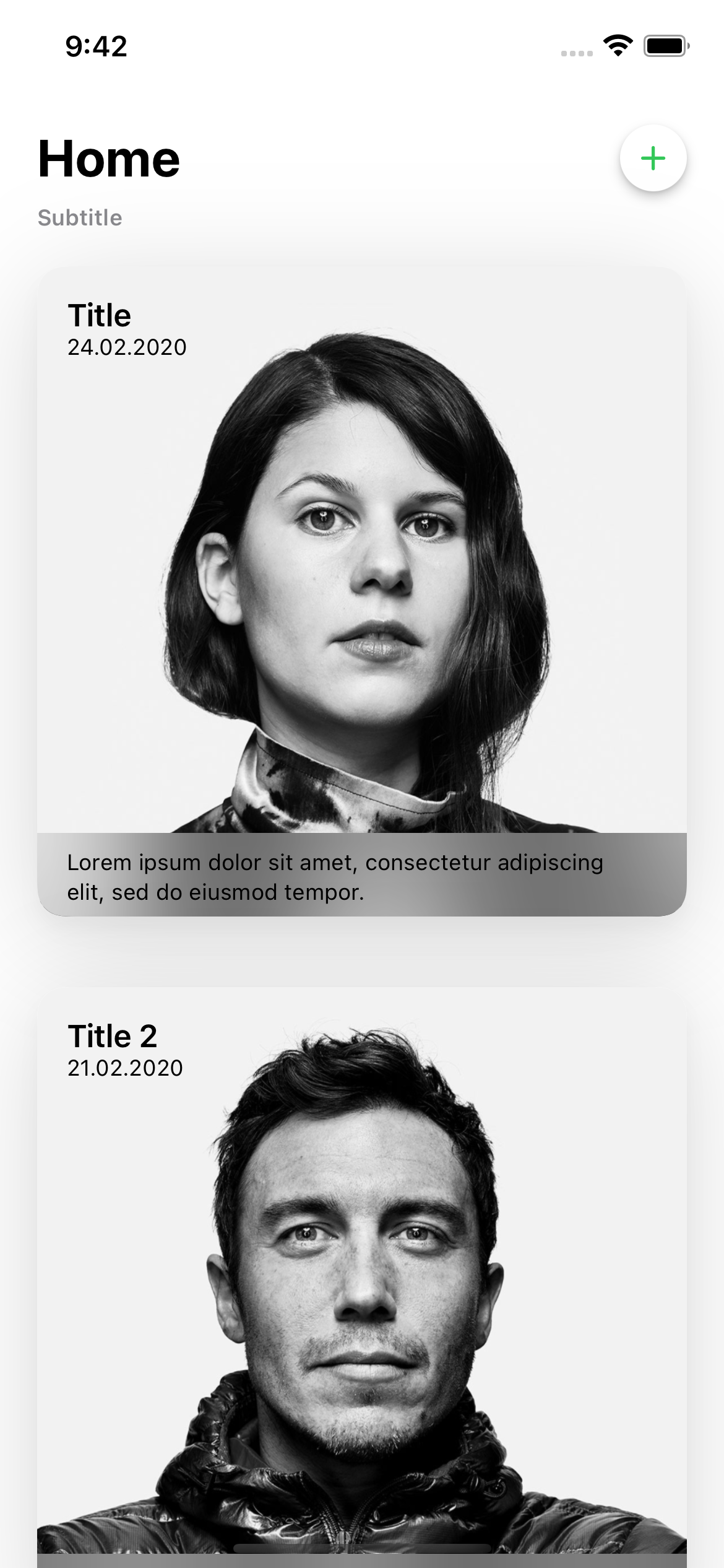

CardView(
    showHeader: .yes( // Wheather header should be visible
        headerTitle: "Title", // Title on the header
        headerSubtitle: "Subtitle", // Subtitle on the header
        headerSubtitleLocation: .below // If Subtitle is above or below the Title
    ),
    cards: $cards, // All the cards in the view
    showCreateButton: .yes( // Wheather create button should be visible
        create: { // Action when create (Plus Button) is tapped
            showCreateTicket.toggle()
        }
    ),
    maxWidth: 428, // The maximum width for cards
    selectedCards: { // Action called on selection of a card
        print("Selected Card")
    },
    deselectedCards: { // Action called on deselection of a card
        print("Deselected Card")
    }
)
ShareSheet
System ShareSheet for SwiftUI.

Mcrich23_Toolkit.presentShareSheet(
    activityItems: ["Hello World"], // Items to share
    excludedActivityTypes: [] // Applications to exclude from share sheet
)
SwiftUI View Modifier
Run code whenever the device rotates.
@State var orientation = UIDevice.current.orientation
var body: some view {
    VStack {
        if orientation == .portrait {
            Text("Hello World")
        }
    }
    .onRotate { newOrientation in
        orientation = newOrientation // Updates the orientation variable
    }
}
Function
Get the top view controller to do a uikit function on the current view instead of the root view
Mcrich23-Toolkit.getTopVC { vc in
    vc.present(view, animated: true)
}
UIViewController
Get the top view controller to do a uikit function on the current view instead of the root view
Mcrich23_Toolkit.topVC.present {
    EmptyView()
}
SwiftUI View Modifier
Run code when the view will dissapear, but before it actually dissapears.
var body: some View {
    Text("This view has dissapeared\(viewModel.dissapearCount)times!")
    .onWillDissapear {
        viewModel.dissapearCount += 1
    }
}
SwiftUI Image
Converts GlyphImage into a SwiftUI Image
ConvertedGlyphImage(GlyphImage: $GlyphImage, defaultIcon: Image(systemName: "apps.iphone") { image in
    image
        .resizable()
        .aspectRatio(contentMode: .fit)
        .foregroundColor(.primary)
}
Function
Opens a url
Mcrich23_Toolkit.openUrl(url: url)
UILabel
Easily hyperlink your UILabel with this component of the Mcrich23-Toolkit
let label: InteractiveLinkLabel = {
    let label = InteractiveLinkLabel()

    let firstChunk = NSMutableAttributedString(string: "Hello, my name is Morris, you cancheck out my website", attributes: nil) // Just text
    let website = NSMutableAttributedString(string: "here",attributes:[NSAttributedString.Key.link: URL(string: "https://mcrich23.com")!]) //Hyperlinked word

    //Put it together
    let fullAttributtedText = NSMutableAttributedString()
    fullAttributtedText.append(firstChunk)
    fullAttributtedText.append(tos)

    label.attributedText = fullAttributtedText
    label.numberOfLines = 0
    label.sizeToFit()
    label.translatesAutoresizingMaskIntoConstraints = false
    label.isUserInteractionEnabled = true
    label.customUrlHandler = { url in // Open url in a custom way, Note: you may need todeclare in viewDidLoad
        let safari = SFSafariViewController(url: url)
        self.present(safari, animated: true)
    }

    return label
}()
UITextView
Easily hyperlink your UITextView with this component of the Mcrich23-Toolkit
let textView: InteractiveLinkLabel = {
    let textView = InteractiveLinkLabel()

    let firstChunk = NSMutableAttributedString(string: "Hello, my name is Morris, you cancheck out my website", attributes: nil) // Just text
    let website = NSMutableAttributedString(string: "here",attributes:[NSAttributedString.Key.link: URL(string: "https://mcrich23.com")!]) //Hyperlinked word

    //Put it together
    let fullAttributtedText = NSMutableAttributedString()
    fullAttributtedText.append(firstChunk)
    fullAttributtedText.append(tos)

    // Modifiers
    textView.attributedText = fullAttributtedText
    textView.numberOfLines = 0
    textView.sizeToFit()
    textView.translatesAutoresizingMaskIntoConstraints = false
    textView.isUserInteractionEnabled = true
    textView.customUrlHandler = { url in // Open url in a custom way, Note: you may need todeclare in viewDidLoad
        let safari = SFSafariViewController(url: url)
        self.present(safari, animated: true)
    }

    return label
}()
Enum
Different types of glyphs, whether it be icons, or images. one variable for all the types.
Convert it to an image with ConvertedGlyphImage
GlyphImage.systemImage(named: "x.circle") // Uses SF Symbols
GlyphImage.systemImage(named: "person1") // Uses Assets.xcassets
GlyphImage.remoteImage(url: self.url) // Fetches from url and displays image
GlyphImage.defaultIcon // The default icon that you specify
Class
Watch connection to the internet and use information to modify app behavior.
Note: You must call startMonitoring in order for NetworkMonitor to start working.
Start Monitoring: NetworkMonitor.shared.startMonitoring() (Call in AppDelagate)
Stop Monitoring: NetworkMonitor.shared.stopMonitoring()
Get Connection Type: NetworkMonitor.shared.connectionType (Unknown can mean disconnected)