A simpler, more elegant UITableView, more in the style of SwiftUI than UIKit. Rows are managed by objects. Things happen with blocks.
Your whole table is declared up front with no delegates.
The table view uses a responder chain approach to provide settings. Any setting can be set at the row level, the section level or the table level.
This allows simple configuration at the table level, and easy customisation at the row level.
Blocks are used for tap handlers, delete handlers, styling, etc.
Default (coloured) accessories are supported
HSTableView is suitable for situations where there is a known finite number of rows (although the number can change). It doesn’t support infinite scrolling tables (you’ll have to use UITableView and delegates for that!).
Use CocoaPods
pod 'HSTableView'or Use Swift Package Manager
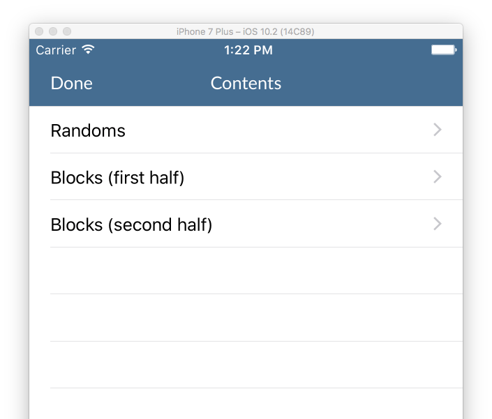
A simple table with three rows and click handlers for each:
    func populateTable()
    {
        table.startDataUpdate()

        self.table.addSection()
        //All the rows have the same accessory type, so define it at the table level
        table.info.accessoryType = .disclosureIndicator

        table += HSTVRowInfo(title:"Randoms") {
            (rowInfo) in
            print("Clicked on row 1")
        }

        table += HSTVRowInfo(title:"Blocks (first half)") {
            (rowInfo) in
            print("Clicked on row 2")
        }

        table += HSTVRowInfo(title:"Blocks (second half)") {
            (rowInfo) in
            print("Clicked on row 3")
        }

        self.table.applyDataUpdate()
}Each cell is handled using the responder chain
HSTVRowInfo -> HSTVSectionInfo -> HSTVTableInfo
so, for example to get the colour of the title, for a row, the table first checks whether titleColor is set on the HSTVRowInfo. If that is null, it checks the HSTVSectionInfo, and if that is null, it checks HSTVTable info
This means that for things which apply to your whole table or section, you can set them once at the top level - and can still override specific values on a per-row level.
You can customise display with the standard setters (title, subtitle, style, etc)
    var row = HSTVRowInfo(title:"MyTitle", subtitle:"My Subtitle")
    row.titleColor = .red
    row.leftImageName = "MyImageName"

    table += row
or using the afterCreate or beforeDisplay handlers
   var row = HSTVRowInfo(title:"MyTitle", subtitle:"My Subtitle")
   row.styleAfterCreateHandler = {
       row,cell in

       cell.myCustomLabel.text = "TextForCustomLabel"
   }

   table += row
note - if you're doing the same customisation for multiple cells - you can use a handler at the table or section level and access the info you need from the customInfo property
   table.info.styleAfterCreateHandler = {
       row,cell in

       cell.myCustomLabel.text = row.customInfo!.customLabelText
}-
You can use the standard cell formats by setting HSTVRowInfo.style
-
You can specify a custom nib with HSTVRowInfo.nib
-
You can create a custom cell by subclassing HSTVRowInfo and overriding
func makeNewCell(_ identifier: String, inheritedStyle: UITableViewCellStyle) -> UITableViewCell
I often use tables for true/false settings in my app. there is a custom handler which can show/hide a checkmark and update a boolean UserDefault when the user taps on the row
	row.handleCheckmark(userDefault:"TestDefault",
                            checkedSubtitle: "Checked (user default true)",
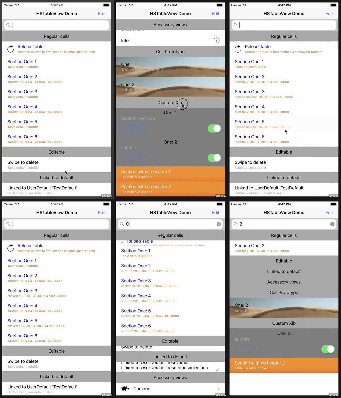
uncheckedSubtitle: "UnChecked (user default false)")You can use the filter option to animate the appearance & disappearance of cells in your table. When a row is hidden, then it’s height is set to 0 so that it can be animated away. You should consider this when designing your cell - the animation will work much faster if the cell has a fixed-height view so that it doesn’t need to be re-drawn multiple times as the cell animates down.
For example - to filter the table by title, based on the text in a search bar:
   func searchBar(_ searchBar: UISearchBar, textDidChange searchText: String) {

       tableView.filter { (row) -> Bool in
           return row.title?.contains(string: searchText) ?? false
       }
}this function completely defines the example table
    func populateTable()
    {
        table.startDataUpdate()
        table.allowsSelectionDuringEditing=true

        // Provide defaults for all rows in the table
        // This will apply unless a value is set at a more specific level (section or row)
        table.info.subtitleColor = UIColor.lightGray
        table.info.subtitle="Table default subtitle"
        table.info.clickHandler = {row in
            //Default click handler prints the index path, updates the subtitle and redraws the row
            print("Table handler click: \(row.lastIndexPath)")
            row.subtitle="clicked at \(Date.init())"
            row.redrawCell(UITableViewRowAnimation.fade)
        };

        // Section
        // Add a section with a simple title
        //
        var section=self.table.addSection("Regular cells")
        // Provide some defaults for items in this section
        section.info.titleColor=UIColor.blue
        section.info.subtitleColor=UIColor.orange

        //First row has a simple click handler that reloads the table data
        //The number or rows is random - so you can see the effect of the reload
        var row=HSTVRowInfo(title:"Reload Table",subtitle: "Number of rows in first section is somewhat random")
        row.leftImageName="713-refresh-1"
        row.clickHandler = {
            [unowned self] (row) in
            self.populateTable()
        };
        table += row

        let numberOfRandoms=arc4random_uniform(6)
        //Random number of rows with the title 'Section One'
        //Odd rows get their subtitle from the table
        //Even rows have their own subtitle
        for i in 1...(2+numberOfRandoms) {
            row=HSTVRowInfo(title:"Section One: \(i)")
            if (i%2==0)
            {
                row.subtitle="subtitle \(Date.init())"
                row.clickHandler = {row in
                    print("Regular cell section click handler, \(i)")
                };
            }
            table += row
        }

        // Section
        // Simple swipe to delete row
        //
        self.table.addSection("Editable")
        row = HSTVRowInfo(title: "Swipe to delete")
        row.editingStyle=UITableViewCellEditingStyle.delete
        row.deleteHandler=row.simpleDeleteHandler
        table += row

        // Section
        // Row value is linked to the user default 'TestDefault'
        //
        self.table.addSection("Linked to default")
        row = HSTVRowInfo(title: "Linked to UserDefault 'TestDefault'")
        row.handleCheckmark(userDefault:"TestDefault",
                            checkedSubtitle: "Checked (user default true)",
                            uncheckedSubtitle: "UnChecked (user default false)")
        table += row

        //Row value is linked to the user default 'TestDefault', but checkmark shows when value is false
        row = HSTVRowInfo(title: "Linked to UserDefault 'TestOppositeDefault'")
        row.handleCheckmark(userDefault:"TestOppositeDefault",
                            checkedSubtitle: "Checked (user default false)",
                            uncheckedSubtitle: "UnChecked (user default true)",
                            checkmarkShowsForFalse: true)
        table += row

        // Section
        // Various accessory views
        // (including coloured disclosure indicators)
        section=self.table.addSection("Accessory views")
        section.info.subtitle=""

        row = HSTVRowInfo(title:"Chevron")
        row.accessoryType = .disclosureIndicator
        row.leftImageName="04-squiggle"
        row.tintColor=UIColor.orange
        row.tintChevronDisclosures = true
        table += row


        row = HSTVRowInfo(title:"Chevron")
        row.accessoryType = .disclosureIndicator
        row.tintColor=UIColor.orange
        table += row


        row = HSTVRowInfo(title:"Disclosure")
        row.accessoryType = .detailDisclosureButton
        row.leftImageName="04-squiggle"
        row.leftImageColor=UIColor.purple
        row.tintColor=UIColor.orange
        row.tintChevronDisclosures = true
        row.accessoryClickHandler = {
            row in
            print ("Disclosure accessory clicked")
        }
        table += row

        row = HSTVRowInfo(title:"Checkmark")
        row.accessoryType = .checkmark
        table += row

        row = HSTVRowInfo(title:"Info")
        row.accessoryType = .detailButton
        row.accessoryClickHandler = {
            row in
            print ("Info accessory clicked")
        }
        table += row

//         Section
//         Row loaded from prototype cell
        section = self.table.addSection("Cell Prototype")
        section.info.reuseIdentifier = "ProtoCell"


        for i in 1...2 {
            let row=HSTVRowInfo(title:"One: \(i)")
            if (i%2==0)
            {
                row.subtitle="subtitle"
            }
            table += row
        }


        // Section
        // Row loaded from custom xib
        //
        section = self.table.addSection("Custom Xib")
        section.info.subtitle="Section Override"
        let myNib = UINib(nibName: "MyTableViewCell", bundle: nil)
        section.info.nib=myNib
        section.info.estimatedRowHeight=150

        for i in 1...2 {
            let row=HSTVRowInfo(title:"One: \(i)")
            if (i%2==0)
            {
                row.subtitle="subtitle"
            }
            table += row
        }

        // Section
        // Nil title for section makes the header invisibile
        // styleAfterCreate handler used to set custom background and override label colours
        //
        section=self.table.addSection(nil)
        for i in 1...2 {
            let row=HSTVRowInfo(title:"Section with no header \(i)")
            table += row
        }

        //style after create handler in this section customises the row in code
        //setting a reuseTag makes sure that this cell is not re-used elsewhere
        section.info.styleAfterCreateHandler = {
            row,cell in

            //os caches imageNamed results
            var image=UIImage(named:"tableRowBackground.png")
            image=image?.stretchableImage(withLeftCapWidth: 30, topCapHeight: 2)

            cell.backgroundView=UIImageView.init(image: image)

            cell.textLabel?.textColor=UIColor.white
            cell.detailTextLabel?.textColor=UIColor.white
        }
        section.info.reuseTag="orange"

        self.table.applyDataUpdate()
    }
